


Pantone attracts media attention in the design world with the annual announcement of its colour of the year. For 2026, the choice fell on Cloud Dancer - a soft shade of white which, according to Pantone, symbolises calm, clarity and a new beginning. But this year it is worth taking a particularly critical look: Is white really a trend prediction or is this a particularly daring marketing manoeuvre?
The Pantone colour 2026: Cloud Dancer
Cloud Dancer, also known as PANTONE 11-4201, is described by Pantone as an "airy, balanced white full of serenity". It is the first time in the history of the Pantone Colour of the Year that a shade of white has been chosen. The official justification: In a society characterised by sensory overload, Cloud Dancer is intended to serve as a "symbol of calming influence" and help rediscover the value of "quiet reflection".
The marketing campaign shows a woman dressed in white dancing in front of a cloudy sky, a metaphor for lightness and freedom. Leatrice Eiseman, Executive Director of the Pantone Colour Institute, explains: "The clutter around us has become overwhelming, making it harder to hear the voices of our inner selves. As a conscious statement of simplification, Cloud Dancer improves our focus."
So much for the official interpretation. But let's take a closer look.
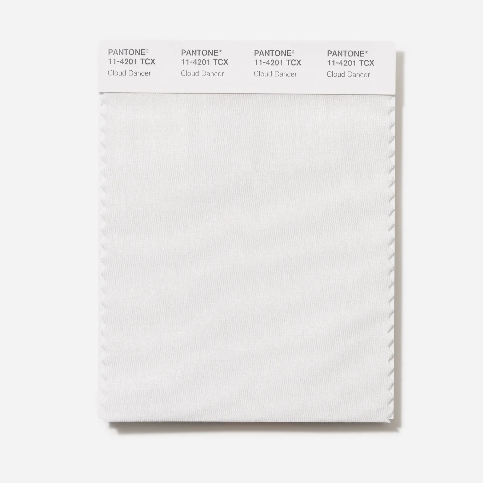
"Cloud Dancer", the Pantone colour of the year 2026 Photo: Courtesy of Pantone
The seven colour palettes for Pantone Colour of the Year 2026: Cloud Dancer
Pantone has developed seven colour palettes to show how versatile Cloud Dancer can be used. Each palette offers its own mood:
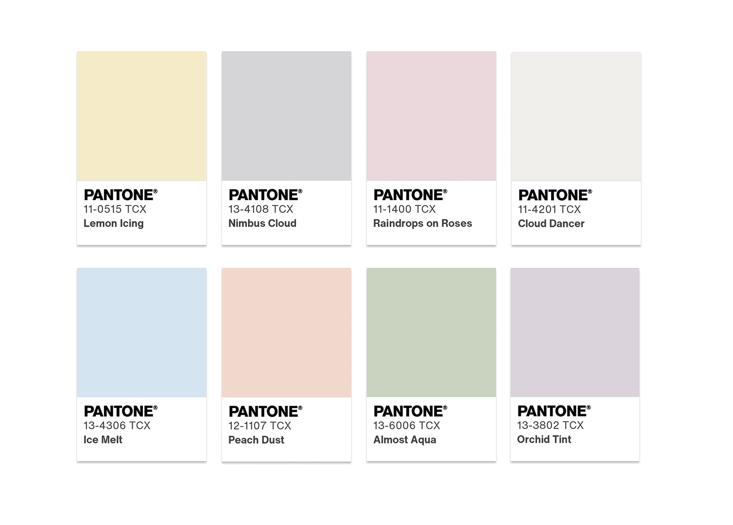
Powdery pastels
A delicate combination of pastel shades such as Lemon Icing, Nimbus Cloud, Raindrops on Roses, Ice Melt, Peach Dust, Almost Aqua and Orchid Tint. This palette epitomises a soft, understated aesthetic - "nuanced, pleasant and unobtrusive", as Eiseman describes it.
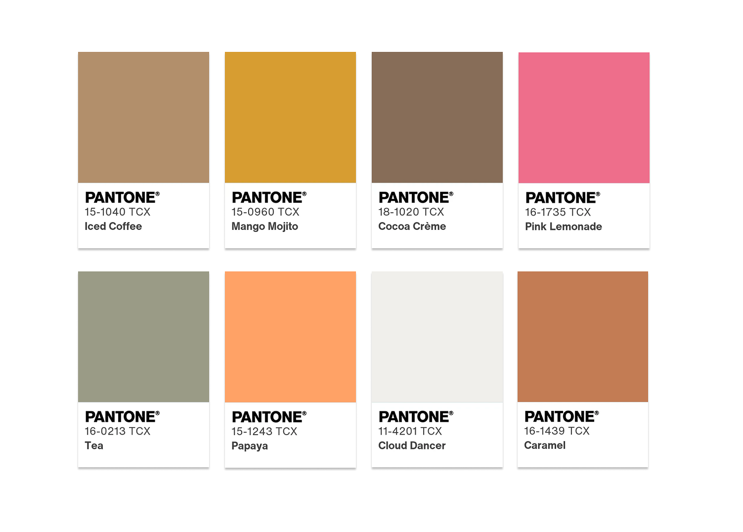
Mango Mojito
This playful palette combines vibrant colours such as Iced Coffee, Mango Mojito, Cocoa Creme, Pink Lemonade, Tea, Papaya and Caramel. Eiseman calls it "pure fun" - here Cloud Dancer is allowed to be the calm pole that carries the colourful accents.
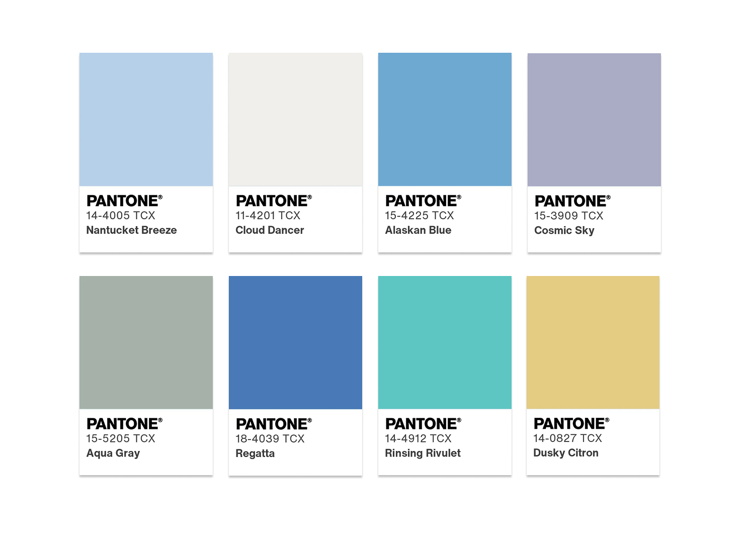
Atmospheric
Shades such as Nantucket Breeze, Alaskan Blue, Cosmic Sky, Aqua Gray, Regatta, Rinsing Rivulet and Dusky Citron create an ethereal, airy atmosphere reminiscent of mist, sky and Nordic expanses.
Comfort zone
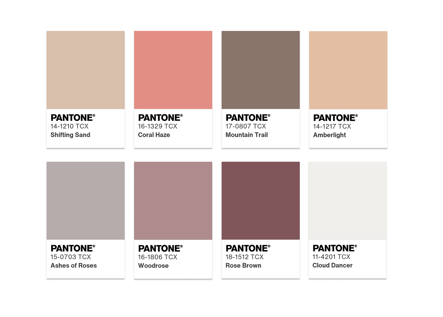
Natural, earthy colours such as Shifting Sand, Coral Haze, Mountain Trail, Amberlight, Ashes of Roses, Woodrose and Rose Brown create an inviting, relaxing environment - perfect for designs that are intended to convey a sense of security.
Tropical colours
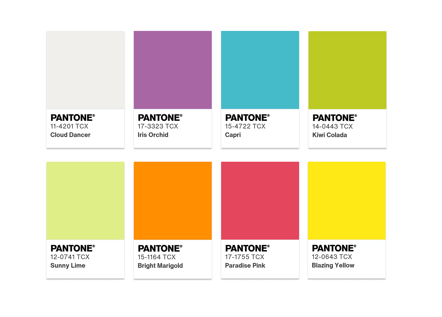
The tropical palette focuses on electric colours: Iris Orchid, Capri, Kiwi Colada, Sunny Lime, Bright Marigold, Paradise Pink and Blazing Yellow. Cloud Dancer becomes a point of calm between intense explosions of colour.
Light and shadow
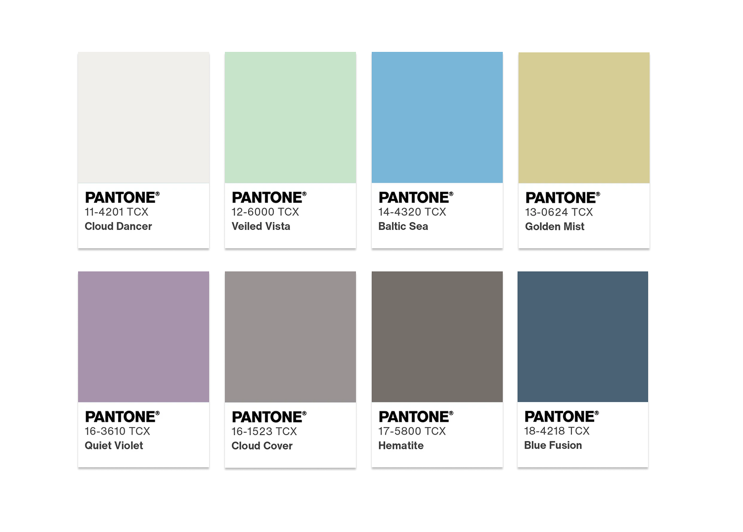
This nuanced palette plays with contrasts: Veiled Vista, Baltic Sea, Golden Mist, Quiet Violet, Cloud Cover, Hematite and Blue Fusion create depth and dimension through the transition from lighter to darker tones.
Glitz and glamour
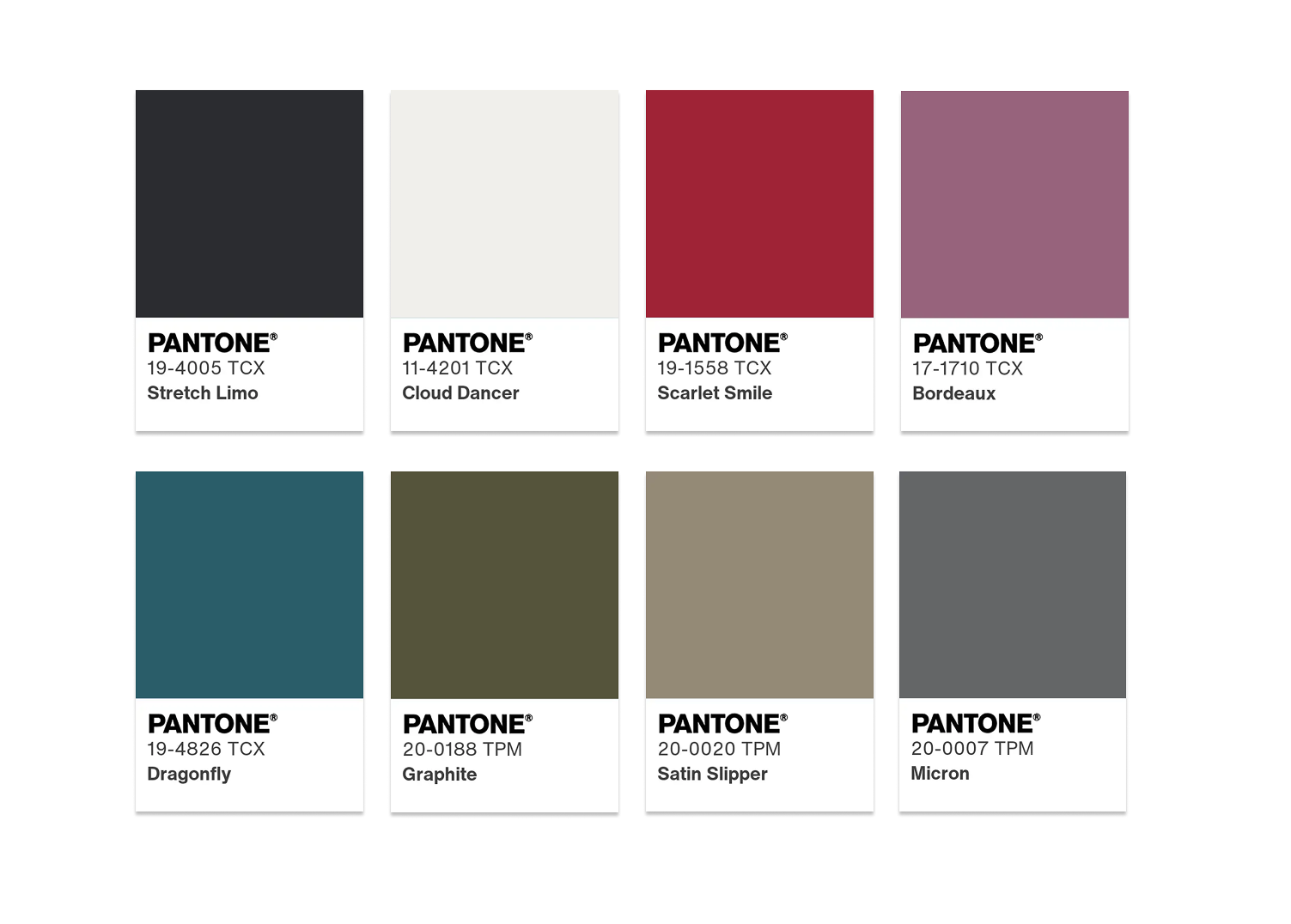
The most glamorous interpretation with Stretch Limo (black), Scarlet Smile, Bordeaux, Dragonfly, Graphite, Satin Slipper and Micron. This is Cloud Dancer at its most sophisticated - polished, sophisticated and designed for statement moments.
These palettes undoubtedly demonstrate the versatility of white as a base and carrier colour. But this is where the critical question begins: is this an innovation or a description of what white has always been?
A look behind the Pantone Colour of the Year trend: marketing or trend prediction?
Pantone has been announcing its colour of the year since 1999 - and the media reach of this event grows with every year. Cloud Dancer is a particularly interesting case. While past choices have often presented unexpected or bold shades - from Viva Magenta to Peach Fuzz to Mocha Mousse - the choice of a shade of white feels like a step backwards into the obvious.
The marketing genius behind the "trend"
White. As a trend colour. Think about that for a moment.
White has been a fundamental colour in architecture, design and fashion for centuries. It is the foundation of minimalist aesthetics, the essence of Scandinavian design philosophy, the basis of every colour theory. White was never gone, it was always there. The choice as "Colour of the Year" therefore seems less like a trend prediction and more like a clever marketing strategy that declares the obvious to be special.
Pantone is first and foremost a company that develops and markets colour standards. The colour of the year is their most successful PR tool - a global talking point that generates collaborations with brands such as Play-Doh, Motorola, Command and Spotify. Every product that appears in "Cloud Dancer" is free advertising for the Pantone system.
Controversy as part of the strategy
Interestingly, the choice of Cloud Dancer has already caused controversy. Social media users wondered whether choosing a shade of white was a statement in the current social and political climate. Others called it "the safest and most boring" choice ever. These discussions? They are part of the game. Controversy generates attention, attention generates reach, reach generates business.
The supposed trend logic
Of course, Pantone provides reasons that embed Cloud Dancer in larger social trends:
1. the longing for peace and quiet
After years of uncertainty, digital noise and global crises, people are longing to slow down. That is true. But does this require the "discovery" of white? Or is marketing following an existing need in order to capitalise on it?
2. the quiet luxury trend
The "quiet luxury" trend - expensive-looking, logo-free, neutral fashion - is indeed present. Think Sofia Richie's wedding or Gwyneth Paltrow's courtroom looks. But this trend is also based on timeless colours such as beige, cream and white. "Predicting" Cloud Dancer is like "predicting" that the sky is blue.
3. the blank canvas metaphor
Pantone describes Cloud Dancer as a "blank canvas" that symbolises a new beginning. That is poetic. It's also what designers have been saying about white for centuries. The question is: is a trend being created here or is existing knowledge being sold in a new packaging?
The Pantone colour of the year 2026 Cloud Dancer in event design
Despite all the criticism: white works. It works brilliantly. For event designers, Cloud Dancer as a concept certainly offers possibilities - albeit not revolutionary ones.
Possible applications
In combination with natural materials such as wood, linen and stone, an organic, calming atmosphere is created. Pairing white with metallic accents such as gold, silver or copper gives the design a luxurious touch. With the suggested palettes - from tropical colours to muted pastels - Cloud Dancer can be used as a neutral base.
But none of this is new. It is the application of classic design principles that have always worked.
Products from our range
Our range includes numerous products that match this timeless aesthetic:
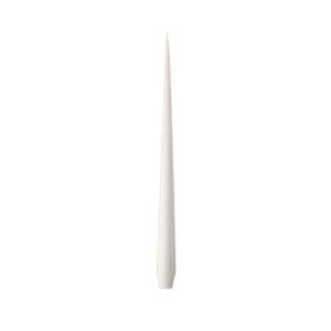
Ester & Erik taper candle ASCHWEISS

PEARL tableware collection
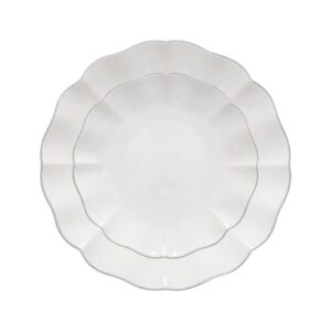
Tableware collection ROSA

OFF-WHITE linen table linen
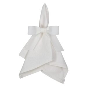
Napkin ring VELVET off-white
Trend report: Sound knowledge instead of marketing promises
In our regularly published Trend reports we not only look at the big announcements such as the Pantone colour of the year, but also critically analyse which movements are actually becoming relevant in event design.
We don't just look at individual colours, but at the underlying cultural, social and aesthetic developments. Our aim is to offer event planners, designers and agencies well-founded trend knowledge - not to blindly repeat marketing messages, but to provide genuine sources of inspiration and practical recommendations.
Subscribe to our trend report here and regularly receive critical analyses, authentic inspiration and in-depth knowledge directly in your mailbox - for events that really have their finger on the pulse, not just on the pulse of marketing departments.
Inspiration or staging?
Cloud Dancer is more than just white - it is a statement about how trends are made. The Pantone Colour of the Year 2026 impressively demonstrates the mechanisms between trend forecasting and marketing strategy.
Should we be inspired? Absolutely. White is and remains a powerful colour in design and event styling. Should we treat it as a revolutionary "discovery"? Hardly.
The real lesson of Cloud Dancer is not the colour itself, but the question it raises: How critically do we as creatives look at the trends that are presented to us? How much of it is genuine innovation and how much is skilful marketing?
In the end, it's not what Pantone announces that counts, but how we as designers, event planners and creatives interpret these impulses and translate them into authentic, targeted concepts. Let us be inspired - but let us remain critical thinkers. Because in the end, our colour palettes should speak, not remain silent.
Design is created by vision, not by proclamation.
Cloud Dancer may be elegant. It may be calming. But as the "colour of the year", it shows one thing above all: the power of marketing to sell the obvious as a revelation. And that is perhaps the most honest trend statement for 2026.